2022-11-06 22:52:21 +00:00
Allows you to compose custom modules consisting of multiple widgets, including popups.
2022-11-28 22:27:31 +00:00
Labels can display dynamic content from scripts, and buttons can interact with the bar or execute commands on click.
2022-11-06 22:52:21 +00:00
2023-02-01 21:53:07 +00:00
2022-11-06 22:52:21 +00:00
## Configuration
> Type: `custom`
This module can be quite fiddly to configure as you effectively have to build a tree of widgets by hand.
It is well worth looking at the examples.
| Name | Type | Default | Description |
|---------|------------|---------|--------------------------------------|
| `class` | `string` | `null` | Container class name. |
| `bar` | `Widget[]` | `null` | List of widgets to add to the bar. |
| `popup` | `Widget[]` | `[]` | List of widgets to add to the popup. |
### `Widget`
2023-01-29 17:47:01 +00:00
| Name | Type | Default | Description |
|---------------|-----------------------------------------|--------------|---------------------------------------------------------------------------|
| `widget_type` | `box` or `label` or `button` or `image` | `null` | Type of GTK widget to create. |
| `name` | `string` | `null` | Widget name. |
| `class` | `string` | `null` | Widget class name. |
| `label` | `string` | `null` | [`label` and `button` ] Widget text label. Pango markup supported. |
| `on_click` | `string` | `null` | [`button` ] Command to execute. More on this [below ](#commands ). |
2023-01-29 22:48:42 +00:00
| `src` | `image` | `null` | [`image` ] Image source. See [here ](images ) for information on images. |
2023-01-29 17:47:01 +00:00
| `size` | `integer` | `null` | [`image` ] Width/height of the image. Aspect ratio is preserved. |
| `orientation` | `horizontal` or `vertical` | `horizontal` | [`box` ] Whether child widgets should be horizontally or vertically added. |
| `widgets` | `Widget[]` | `[]` | [`box` ] List of widgets to add to this box. |
2022-11-06 22:52:21 +00:00
2022-11-28 22:27:31 +00:00
### Labels
Labels can interpolate text from scripts to dynamically show content.
This can be done by including scripts in `{{double braces}}` using the shorthand script syntax.
For example, the following label would output your system uptime, updated every 30 seconds.
```
Uptime: {{30000:uptime -p | cut -d ' ' -f2-}}
```
2023-02-02 20:37:16 +00:00
Both polling and watching mode are supported. For more information on script syntax, see [here ](scripts ).
2022-11-28 22:27:31 +00:00
2022-11-06 22:52:21 +00:00
### Commands
Buttons can execute commands that interact with the bar,
as well as any arbitrary shell command.
To execute shell commands, prefix them with an `!` .
For example, if you want to run `~/.local/bin/my-script.sh` on click,
2022-11-28 22:27:31 +00:00
you'd set `on_click` to `!~/.local/bin/my-script.sh` .
2022-11-06 22:52:21 +00:00
The following bar commands are supported:
- `popup:toggle`
- `popup:open`
- `popup:close`
2023-01-29 17:47:01 +00:00
---
2022-11-06 22:52:21 +00:00
XML is arguably better-suited and easier to read for this sort of markup,
2022-11-28 22:27:31 +00:00
but currently is not supported.
2022-11-06 22:52:21 +00:00
Nonetheless, it may be worth comparing the examples to the below equivalent
to help get your head around what's going on:
```xml
<?xml version="1.0" encoding="utf-8" ?>
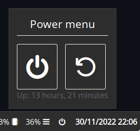
<custom class="power-menu">
<bar>
2022-11-28 22:27:31 +00:00
<button name="power-btn" label="" on_click="popup:toggle"/>
2022-11-06 22:52:21 +00:00
</bar>
<popup>
<box orientation="vertical">
<label name="header" label="Power menu" />
<box>
2022-11-28 22:27:31 +00:00
<button class="power-btn" label="" on_click="!shutdown now" />
<button class="power-btn" label="" on_click="!reboot" />
2022-11-06 22:52:21 +00:00
</box>
2022-11-28 22:27:31 +00:00
<label name="uptime" label="Uptime: {{30000:uptime -p | cut -d ' ' -f2-}}" />
2022-11-06 22:52:21 +00:00
</box>
</popup>
</custom>
```
<details>
<summary>JSON</summary>
```json
{
"end": [
{
2022-11-28 22:27:31 +00:00
"type": "clock"
},
{
2022-11-06 22:52:21 +00:00
"bar": [
{
2022-11-28 22:27:31 +00:00
"on_click": "popup:toggle",
2022-11-06 22:52:21 +00:00
"label": "",
"name": "power-btn",
"type": "button"
}
],
"class": "power-menu",
"popup": [
{
"orientation": "vertical",
"type": "box",
"widgets": [
{
"label": "Power menu",
"name": "header",
"type": "label"
},
{
"type": "box",
"widgets": [
{
"class": "power-btn",
2022-11-28 22:27:31 +00:00
"on_click": "!shutdown now",
2022-11-06 22:52:21 +00:00
"label": "<span font-size='40pt'></span>",
"type": "button"
},
{
"class": "power-btn",
2022-11-28 22:27:31 +00:00
"on_click": "!reboot",
2022-11-06 22:52:21 +00:00
"label": "<span font-size='40pt'></span>",
"type": "button"
}
]
2022-11-28 22:27:31 +00:00
},
{
"label": "Uptime: {{30000:uptime -p | cut -d ' ' -f2-}}",
"name": "uptime",
"type": "label"
2022-11-06 22:52:21 +00:00
}
]
}
2022-11-28 22:27:31 +00:00
],
"type": "custom"
2022-11-06 22:52:21 +00:00
}
]
}
```
</details>
<details>
<summary>TOML</summary>
```toml
2022-11-28 22:27:31 +00:00
[[end]]
type = 'clock'
2022-11-06 22:52:21 +00:00
[[end]]
class = 'power-menu'
type = 'custom'
[[end.bar]]
2022-11-28 22:27:31 +00:00
on_click = 'popup:toggle'
2022-11-06 22:52:21 +00:00
label = ''
name = 'power-btn'
type = 'button'
[[end.popup]]
orientation = 'vertical'
type = 'box'
[[end.popup.widgets]]
label = 'Power menu'
name = 'header'
type = 'label'
[[end.popup.widgets]]
type = 'box'
[[end.popup.widgets.widgets]]
class = 'power-btn'
2022-11-28 22:27:31 +00:00
on_click = '!shutdown now'
2022-11-06 22:52:21 +00:00
label = '''<span font-size='40pt'></span>'''
type = 'button'
[[end.popup.widgets.widgets]]
class = 'power-btn'
2022-11-28 22:27:31 +00:00
on_click = '!reboot'
2022-11-06 22:52:21 +00:00
label = '''<span font-size='40pt'></span>'''
type = 'button'
2022-11-28 22:27:31 +00:00
[[end.popup.widgets]]
label = '''Uptime: {{30000:uptime -p | cut -d ' ' -f2-}}'''
name = 'uptime'
type = 'label'
2022-11-06 22:52:21 +00:00
```
</details>
<details>
<summary>YAML</summary>
```yaml
end:
2022-11-28 22:27:31 +00:00
- type: clock
- bar:
- on_click: popup:toggle
2022-11-06 22:52:21 +00:00
label:
name: power-btn
type: button
class: power-menu
popup:
- orientation: vertical
type: box
widgets:
- label: Power menu
name: header
type: label
- type: box
widgets:
- class: power-btn
2022-11-28 22:27:31 +00:00
on_click: '!shutdown now'
2022-11-06 22:52:21 +00:00
label: <span font-size='40pt'></span>
type: button
- class: power-btn
2022-11-28 22:27:31 +00:00
on_click: '!reboot'
2022-11-06 22:52:21 +00:00
label: <span font-size='40pt'></span>
type: button
2022-11-28 22:27:31 +00:00
- label: 'Uptime: {{30000:uptime -p | cut -d '' '' -f2-}}'
name: uptime
type: label
type: custom
2022-11-06 22:52:21 +00:00
```
</details>
<details>
<summary>Corn</summary>
```corn
let {
$power_menu = {
type = "custom"
class = "power-menu"
2022-11-28 22:27:31 +00:00
bar = [ { type = "button" name="power-btn" label = "" on_click = "popup:toggle" } ]
2022-11-06 22:52:21 +00:00
popup = [ {
type = "box"
orientation = "vertical"
widgets = [
{ type = "label" name = "header" label = "Power menu" }
{
type = "box"
widgets = [
2022-11-28 22:27:31 +00:00
{ type = "button" class="power-btn" label = "<span font-size='40pt'></span>" on_click = "!shutdown now" }
{ type = "button" class="power-btn" label = "<span font-size='40pt'></span>" on_click = "!reboot" }
2022-11-06 22:52:21 +00:00
]
}
2022-11-28 22:27:31 +00:00
{ type = "label" name = "uptime" label = "Uptime: {{30000:uptime -p | cut -d ' ' -f2-}}" }
2022-11-06 22:52:21 +00:00
]
} ]
}
} in {
end = [ $power_menu ]
}
```
</details>
## Styling
Since the widgets are all custom, you can target them using `#name` and `.class` .
| Selector | Description |
|-----------|-------------------------|
| `#custom` | Custom widget container |