mirror of
https://github.com/Zedfrigg/ironbar.git
synced 2025-07-02 03:01:04 +02:00
241 lines
No EOL
4.9 KiB
Markdown
241 lines
No EOL
4.9 KiB
Markdown
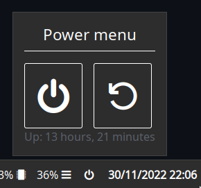
Creates a button on the bar, which opens a popup. The popup contains a header, shutdown button, restart button, and uptime.
|
|
|
|
|
|
|
|
## Configuration
|
|
|
|
<details>
|
|
<summary>JSON</summary>
|
|
|
|
```json
|
|
{
|
|
"end": [
|
|
{
|
|
"type": "clock"
|
|
},
|
|
{
|
|
"bar": [
|
|
{
|
|
"label": "",
|
|
"name": "power-btn",
|
|
"on_click": "popup:toggle",
|
|
"type": "button"
|
|
}
|
|
],
|
|
"class": "power-menu",
|
|
"popup": [
|
|
{
|
|
"orientation": "vertical",
|
|
"type": "box",
|
|
"widgets": [
|
|
{
|
|
"label": "Power menu",
|
|
"name": "header",
|
|
"type": "label"
|
|
},
|
|
{
|
|
"type": "box",
|
|
"widgets": [
|
|
{
|
|
"class": "power-btn",
|
|
"label": "<span font-size='40pt'></span>",
|
|
"on_click": "!shutdown now",
|
|
"type": "button"
|
|
},
|
|
{
|
|
"class": "power-btn",
|
|
"label": "<span font-size='40pt'></span>",
|
|
"on_click": "!reboot",
|
|
"type": "button"
|
|
}
|
|
]
|
|
},
|
|
{
|
|
"label": "Uptime: {{30000:uptime -p | cut -d ' ' -f2-}}",
|
|
"name": "uptime",
|
|
"type": "label"
|
|
}
|
|
]
|
|
}
|
|
],
|
|
"tooltip": "Up: {{30000:uptime -p | cut -d ' ' -f2-}}",
|
|
"type": "custom"
|
|
}
|
|
]
|
|
}
|
|
```
|
|
|
|
</details>
|
|
|
|
<details>
|
|
<summary>TOML</summary>
|
|
|
|
```toml
|
|
[[end]]
|
|
type = 'clock'
|
|
|
|
[[end]]
|
|
class = 'power-menu'
|
|
tooltip = '''Up: {{30000:uptime -p | cut -d ' ' -f2-}}'''
|
|
type = 'custom'
|
|
|
|
[[end.bar]]
|
|
label = ''
|
|
name = 'power-btn'
|
|
on_click = 'popup:toggle'
|
|
type = 'button'
|
|
|
|
[[end.popup]]
|
|
orientation = 'vertical'
|
|
type = 'box'
|
|
|
|
[[end.popup.widgets]]
|
|
label = 'Power menu'
|
|
name = 'header'
|
|
type = 'label'
|
|
|
|
[[end.popup.widgets]]
|
|
type = 'box'
|
|
|
|
[[end.popup.widgets.widgets]]
|
|
class = 'power-btn'
|
|
label = '''<span font-size='40pt'></span>'''
|
|
on_click = '!shutdown now'
|
|
type = 'button'
|
|
|
|
[[end.popup.widgets.widgets]]
|
|
class = 'power-btn'
|
|
label = '''<span font-size='40pt'></span>'''
|
|
on_click = '!reboot'
|
|
type = 'button'
|
|
|
|
[[end.popup.widgets]]
|
|
label = '''Uptime: {{30000:uptime -p | cut -d ' ' -f2-}}'''
|
|
name = 'uptime'
|
|
type = 'label'
|
|
```
|
|
|
|
</details>
|
|
|
|
<details>
|
|
<summary>YAML</summary>
|
|
|
|
```yaml
|
|
end:
|
|
- type: clock
|
|
|
|
- bar:
|
|
- label:
|
|
name: power-btn
|
|
on_click: popup:toggle
|
|
type: button
|
|
class: power-menu
|
|
popup:
|
|
- orientation: vertical
|
|
type: box
|
|
widgets:
|
|
- label: Power menu
|
|
name: header
|
|
type: label
|
|
- type: box
|
|
widgets:
|
|
- class: power-btn
|
|
label: <span font-size='40pt'></span>
|
|
on_click: '!shutdown now'
|
|
type: button
|
|
- class: power-btn
|
|
label: <span font-size='40pt'></span>
|
|
on_click: '!reboot'
|
|
type: button
|
|
- label: 'Uptime: {{30000:uptime -p | cut -d '' '' -f2-}}'
|
|
name: uptime
|
|
type: label
|
|
tooltip: 'Up: {{30000:uptime -p | cut -d '' '' -f2-}}'
|
|
type: custom
|
|
```
|
|
|
|
</details>
|
|
|
|
<details>
|
|
<summary>Corn</summary>
|
|
|
|
```corn
|
|
let {
|
|
$button = { type = "button" name="power-btn" label = "" on_click = "popup:toggle" }
|
|
|
|
$popup = {
|
|
type = "box"
|
|
orientation = "vertical"
|
|
widgets = [
|
|
{ type = "label" name = "header" label = "Power menu" }
|
|
{
|
|
type = "box"
|
|
widgets = [
|
|
{ type = "button" class="power-btn" label = "<span font-size='40pt'></span>" on_click = "!shutdown now" }
|
|
{ type = "button" class="power-btn" label = "<span font-size='40pt'></span>" on_click = "!reboot" }
|
|
]
|
|
}
|
|
{ type = "label" name = "uptime" label = "Uptime: {{30000:uptime -p | cut -d ' ' -f2-}}" }
|
|
]
|
|
}
|
|
|
|
$power_menu = {
|
|
type = "custom"
|
|
class = "power-menu"
|
|
|
|
bar = [ $button ]
|
|
popup = [ $popup ]
|
|
|
|
tooltip = "Up: {{30000:uptime -p | cut -d ' ' -f2-}}"
|
|
}
|
|
|
|
$clock = { type = "clock" }
|
|
} in {
|
|
end = [ $power_menu $clock ]
|
|
}
|
|
```
|
|
</details>
|
|
|
|
## Styling
|
|
|
|
```css
|
|
.power-menu {
|
|
margin-left: 10px;
|
|
}
|
|
|
|
.power-menu #power-btn {
|
|
color: white;
|
|
background-color: #2d2d2d;
|
|
}
|
|
|
|
.power-menu #power-btn:hover {
|
|
background-color: #1c1c1c;
|
|
}
|
|
|
|
.popup-power-menu {
|
|
padding: 1em;
|
|
}
|
|
|
|
.popup-power-menu #header {
|
|
color: white;
|
|
font-size: 1.4em;
|
|
border-bottom: 1px solid white;
|
|
padding-bottom: 0.4em;
|
|
margin-bottom: 0.8em;
|
|
}
|
|
|
|
.popup-power-menu .power-btn {
|
|
color: white;
|
|
background-color: #2d2d2d;
|
|
border: 1px solid white;
|
|
padding: 0.6em 1em;
|
|
}
|
|
|
|
.popup-power-menu .power-btn + .power-btn {
|
|
margin-left: 1em;
|
|
}
|
|
|
|
.popup-power-menu .power-btn:hover {
|
|
background-color: #1c1c1c;
|
|
}
|
|
``` |